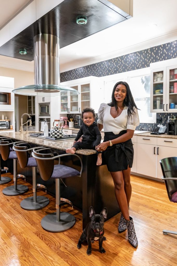
It is night and day between the before and after of this moody kitchen renovation, and the best part is we made minimal changes that had a HUGE impact on the space.
Our first decision was to paint the cabinets. I knew I wanted white for a crisper look, but I’ve loved see kitchens with islands that were a darker, moodier color. Black just felt right. We ended up with SW Iron Ore on the island + BM White Dove everywhere else!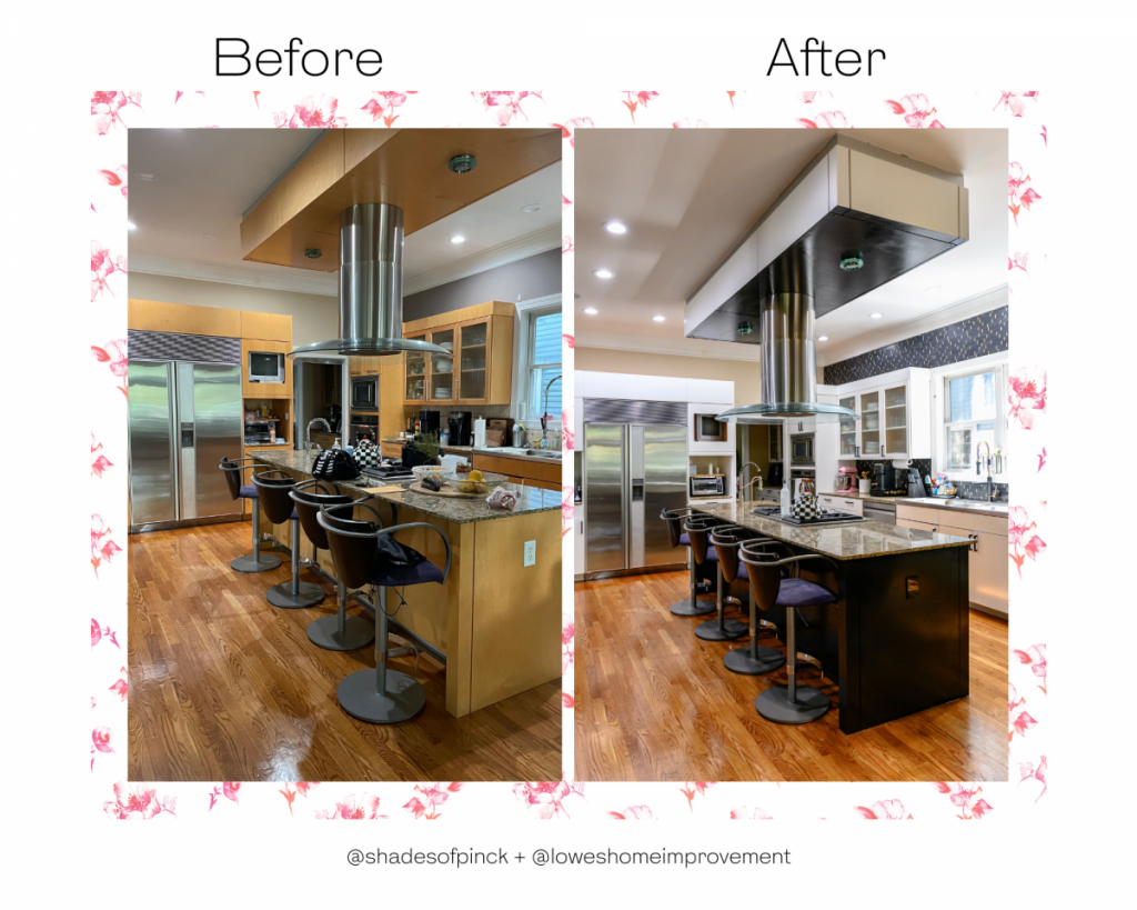
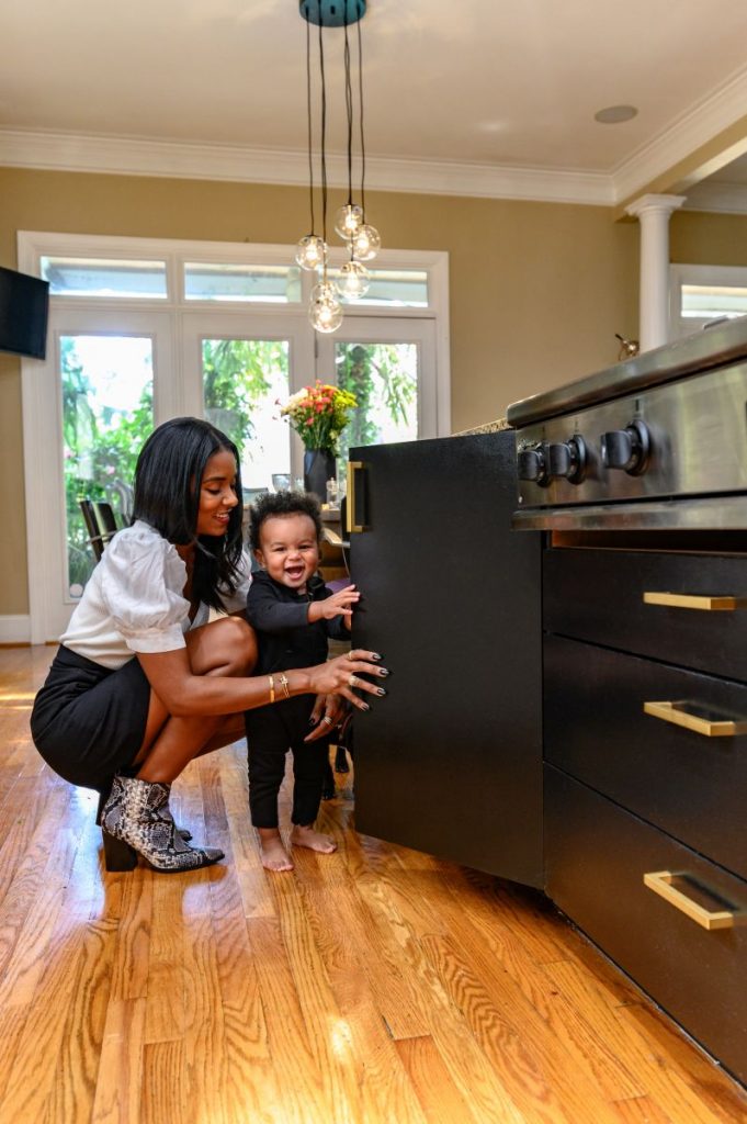
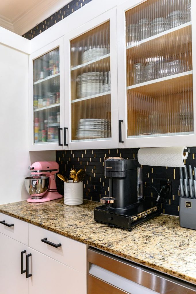
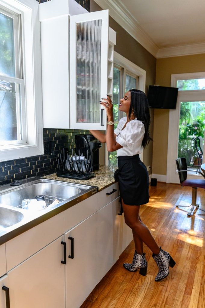
The next choice was to update the hardware! We removed the silver bars and chose a thick, small handle. On the white cabinets, we went with black pulls to add really bold contrast, and then it was my husband’s idea to do the pop of gold on the black cabinetry. I really love how it turned out!
Next, we swapped the old tile work for a black backsplash that had accents of gold + white to really tie together the moodiness. But the big decision was to take it to the top of the ceiling. I think it was the best call because it adds so much texture behind the white cabinets.
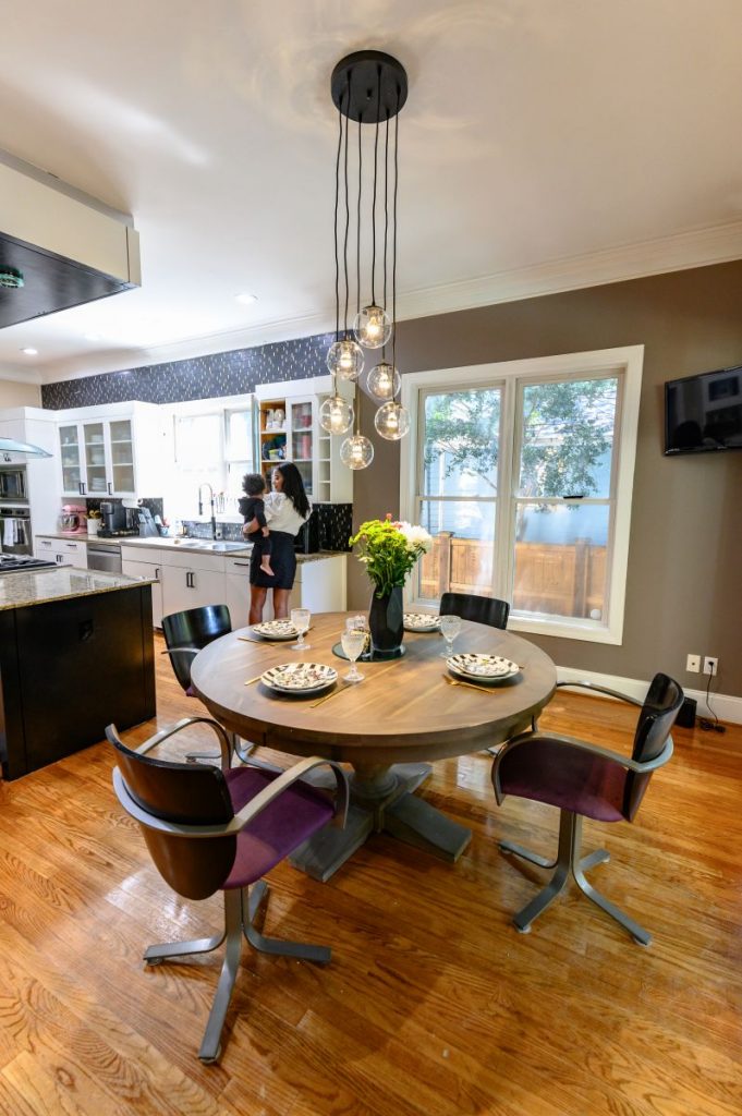
Lastly, we picked this gorgeous light fixture as a statement piece for over the dining room table. It is the perfect balance of light and bright while still maintaining the moody feel throughout the kitchen area.
